Meraki
A concept landing page for a modern Greek taverna in Nürnberg — built entirely with zero content, photography or brief from a client, and trilingual (German/English/Greek) from day one.
Preview the concept ↗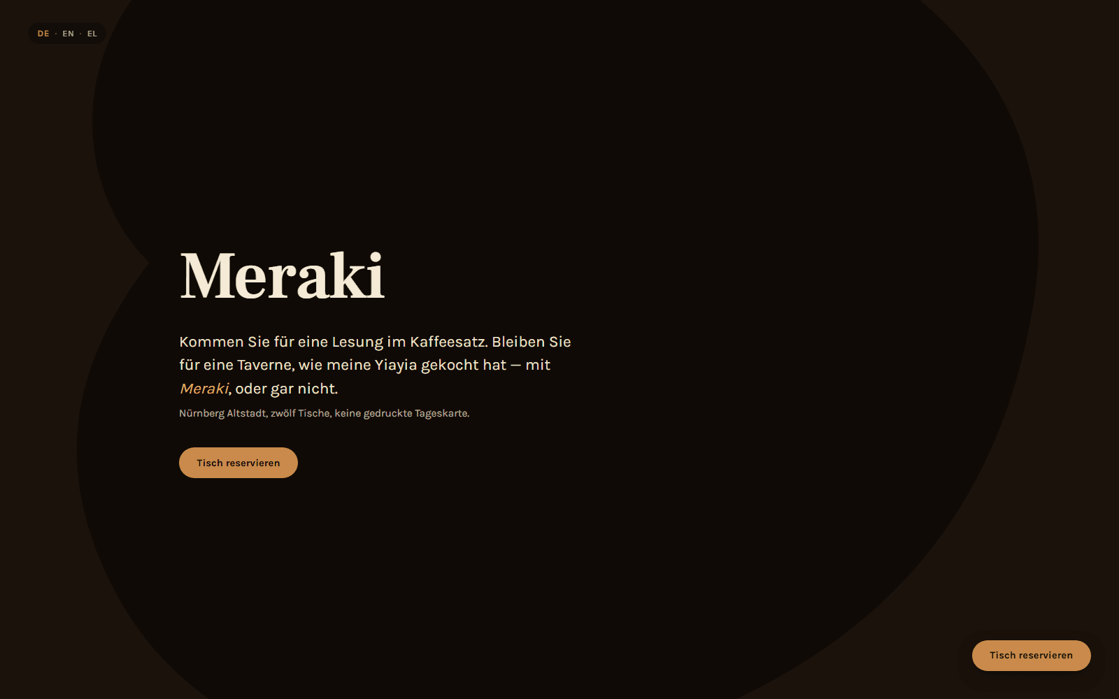
Client
Self-directed concept
Year
2026
Preview at
azkigo.dev ↗Services
- Concept & copywriting
- Landing page design
- Trilingual localization
Stack
The problem
A landing page has one shot: one screen, one scroll, no second page to redeem a bad first impression. And a pattern shows up constantly in real inquiries — most people who reach out don't have a menu written, photos taken, or copy ready yet, and that shouldn't be what stands between them and seeing what's possible.
The approach
I built this with zero client input — no brief, no menu, no photography — specifically to prove that isn't a blocker. The whole page borrows its structure from a Greek coffee-cup fortune ritual: pour, wait, reveal, with each dish introduced the way a fortune-teller reads a cup instead of a category label. I wrote it fully trilingual from day one — German by default for the real target customer, with English and Greek as genuine, separately-authored options rather than a machine-translated afterthought.
What came out of it
- →Went from a blank page to a finished, trilingual site with zero content, photography, or brief provided — proof the Landing package doesn't need a client to be ready first
- →German by default, with English and Greek written as real, separately-authored options — not machine translation bolted on afterward
- →An honest trade-off, stated plainly: I chose memorable over fastest-to-skim, and leaned on type and color because there was nothing to photograph — real photography is still what most restaurant clients will actually want
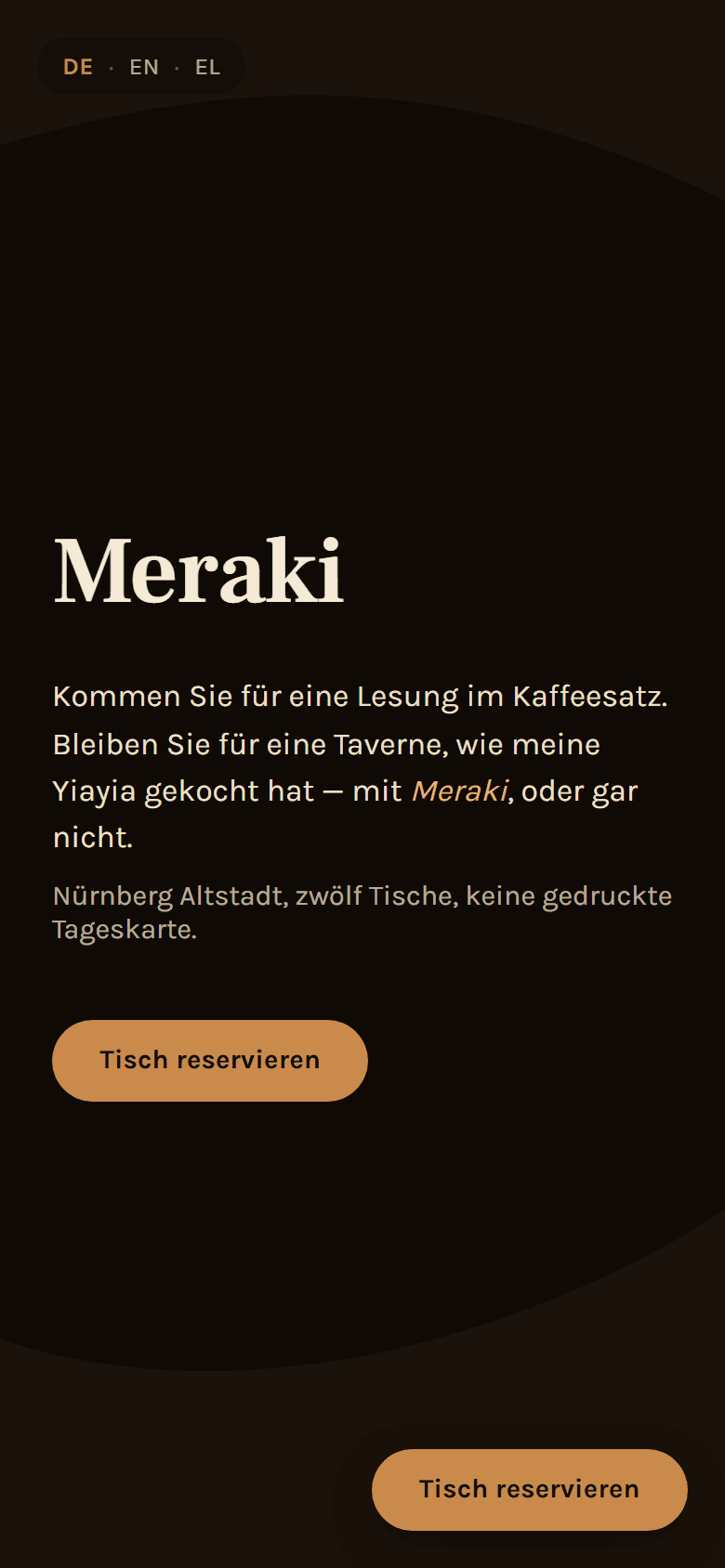
On mobile
A single page has less to prove on mobile than a full app, but the same discipline still applies: the language switcher and reservation button never collide with content at any width, type holds up without forcing horizontal scroll, and the whole scroll-triggered motion system — including the cup-rim divider — was checked start to finish on a phone-sized viewport, not just assumed to scale down cleanly.
Next project
GDL Hub